Hi All,
For those of you with a good memory, I have
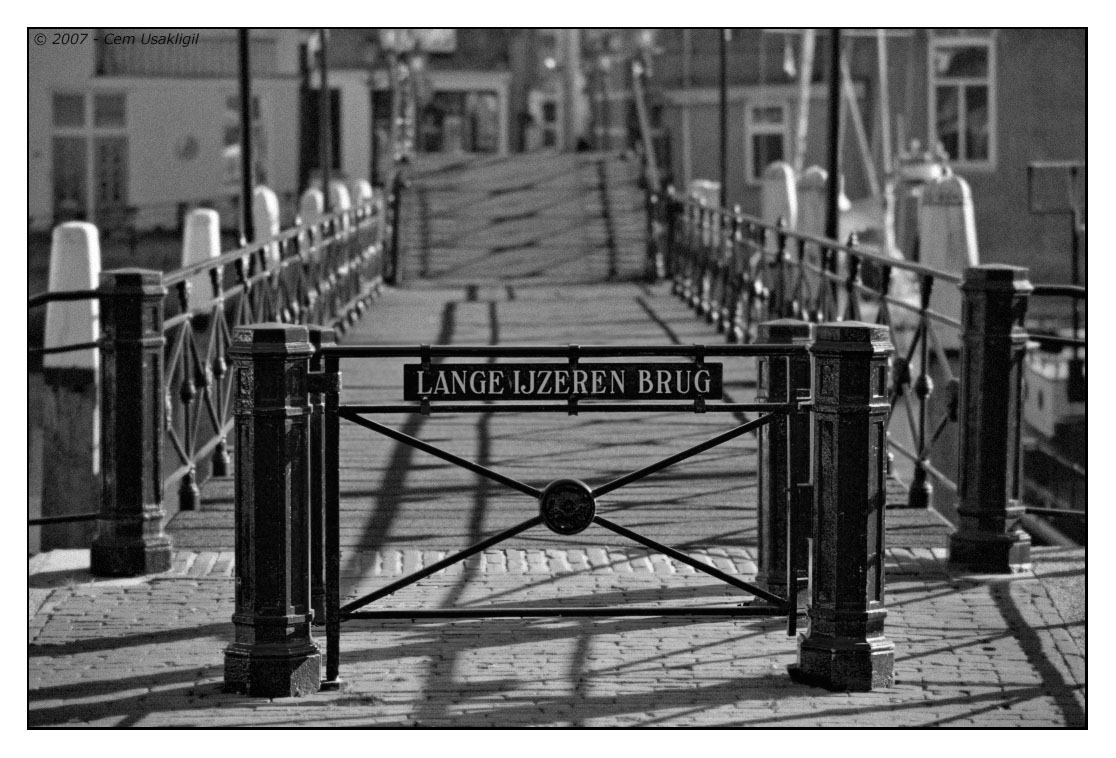
posted this picture of the "Long Iron Bridge" a long while back. Earlier last year, I went back for a reshoot while testing my then new toy (i.e. the TS-E 24mm f/3.5 Mk II).
Cem,
I have spent countless hours on the first image. It was a very hard and difficult challenge for me. Everyone like's Bambi in the woods, caught by rays of light breaking through the canopy. Who doesn't enjoy stellar landscapes from Scotland or of children playing in the street? You however chose a dark bridge, with the center risen so one couldn't proceed. Now I understand it all much better and your latest picture, below,(one of many more of this bridge, I would hope), adds a new dimension of time and a motif of opportunity.
Cem Usakligil: Long Iron Bridge
Shown in B&W originally here
It's an important historical and cultural monument but also part of a fun street and district. Your first picture showed the bridge blocked, so to speak, so our travel forward had to be put off.
The Long Iron Bridge - Revisited
Original
The HDR tone mapping is impressive. With that success, as Bart points out, the sky steals the show. But what is the most important feature? It's the wonderful place to visit on the other side of the bridge. So now we know that we need to be thrust forward in the center. That means that anything but cursory attention to the sides will under-power the thrust forward. Right now, we get distracted. Also, if we start from dark and proceed to light, we help the force driving us into the picture and across the bridge.
We really want to see what's there, over the bridge and explore. So, Cem, in looking at this brightly made version, it's not sufficient to be so well lit with gorgeously rich colors. Beautifully done and commendable, BTW!
Still, we
also want, if we can, to
continue our journey to where it's so magic and even "touristy" beautiful.
The Long Iron Bridge - Revisited
Edited by AK to follow the metaphor, "Life as a Journey" "blocked" in Cem's first and dark Iron Bridge Picture
To me it's about using a myriad of ways to rank elements in importance. So, there are now many nuanced changes introduced to get the top of the clouds to be less important, maintain the crepuscular rays, enhance the pretty buildings on the far side of the bridge, sharpen and increase the contrast of the rails to lead us upwards across the bridge, darken the foreground with also increase the specular lights on the "gate" and the name and so forth. The net result is a transition from our memory of darkness to a brighter journey ahead of us.
I do hope that this presentation meets well with what you had imagined all along. Still, it's another way of thinking about this interesting bridge.
Thanks for sharing,
Asher


")