![]() |
|
HOME
FORUMS
NEWS
FAQ
SEARCH
|
|
|||||||
| CM Theory and Practice Profiles, color spaces, perception, science. |
![]() |
|
|
Thread Tools | Display Modes |
|
#1
|
|||
|
|||
|
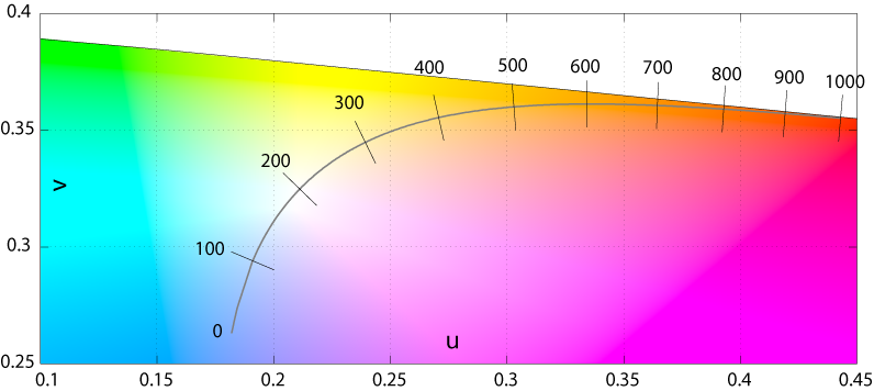
How do color meters take into account the iso-effect line in the Plankian locus plot of color temp on a map of colors.
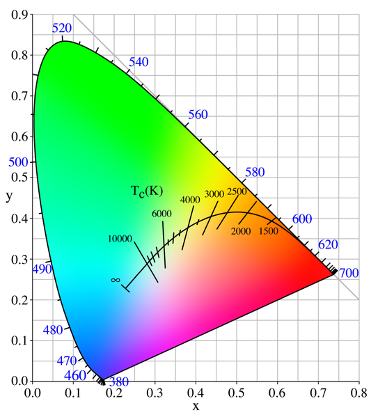
As you can see there are a lot of different chromaticities represented at each iso temp line perpendicular to the temperature axis. For example, it appears that a temperature of 10,000 degrees K could be seen in a color varying from green through cyan and blue to magenta! So do the meters actually isolate amber-blue from magenta-cyan? Or is the magenta cyan also used in determining color temp? Also are there meters that give the relative proprtions of cyan and blue in the light too to qualify the color temperature beyond amber to blue? Asher
__________________
Follow us on Twitter at @opfweb Our purpose is getting to an impressive photograph. So we encourage browsing and then feedback. Consider a link to your galleries annotated, C&C welcomed. Images posted within OPF are assumed to be for Comment & Critique, unless otherwise designated. |
|
#2
|
|||
|
|||
|
I am not really sure about your question, but the meter in my camera (which is basically a software implementation of the old Minolta Thermocolorimeter III) gives the color temperature in ° Kelvin and a color compensation value on the green-magenta axis .
|
|
#3
|
|||
|
|||
|
Quote:
Asher
__________________
Follow us on Twitter at @opfweb Our purpose is getting to an impressive photograph. So we encourage browsing and then feedback. Consider a link to your galleries annotated, C&C welcomed. Images posted within OPF are assumed to be for Comment & Critique, unless otherwise designated. |
|
#4
|
|||
|
|||
|
Yes, Minolta and Sony DSLRs have this capability (I am not entirely sure about the low end of Sony cameras). I think that Minolta advertised it at the time they issued the 7D. Their second DSLR, the 5D, also has it.
|
|
#5
|
|||
|
|||
|
Quote:
I guess it depends on the actual implementation, but probably many will use a somewhat dumbed down approximation. Color temperature is not a color, but the total integrated power spectrum of a blackbody radiator, or similar source. Sampling that total spectral emission with just 2 or 3 spectral band filters, or averaging between three color coordinates will remain an approximation (particularly inaccurate with spikey spectra, e.g. fluorescent tubes). Only a spectrophotometer can calculate an accurate colortemperature, because the whole spectral emission will be integrated at narrow intervals. Narrower intervals will get more accurate estimates of spikey spectra. Quote:
What we have available in our Raw converter software is a Correlated Color Temperature (CCT) control. The Planckian locus is marked on the Color temperature scale, and the Isotherms are marked on the Tint scale. Quote:
Cheers, Bart
__________________
If you do what you did, you'll get what you got. |
|
#6
|
|||
|
|||
|
Quote:
I happened to find a Gossen colorimeter on sale and hopefully it will help both my film and color photography by choosing filters to correct light beforehand. With digital, this may decrease color noise under some circumstances. Maybe, this picture is better. The color temps are shown in mireds, the inverse of color temp x10-6. ![]() "Close up of the Planckian locus in the CIE 1960 UCS, with the isotherms in mireds. Note the even spacing of the isotherms when using the reciprocal temperature scale, and compare with the similar figure below. The even spacing of the isotherms on the locus implies that the mired scale is a better measure of perceptual color difference than the temperature scale." See the original source for further details. I've moved to becoming "color aware" in film at least. So that's the motivation for acquiring both a color meter and also mired filters to adjust color temp, the blue-amber axis and cyan-magenta, the tint quality of the light. The downside is that any glass, resin or polyester in the light path of the incoming image is going to have some cost in terms of degradation. Asher
__________________
Follow us on Twitter at @opfweb Our purpose is getting to an impressive photograph. So we encourage browsing and then feedback. Consider a link to your galleries annotated, C&C welcomed. Images posted within OPF are assumed to be for Comment & Critique, unless otherwise designated. |
|
#7
|
|||
|
|||
|
Hi, Asher,
Quote:
Recall that both those factors are needed to specify the chromaticity of the incident light - what we need to do the best practical approximation of ideal white balance color correction. The correlated color temperature (CCT) of the light alone will not do it. Some meters rigorously determine the chromaticity of the observed light. They are very complex, and conceptually determine the spectral density function of the light and then (numerically) multiply it by three different functions of wavelength and integrate to get the CIE X, Y, and Z coordinates, from which the x and y values (indicative of chromaticity) can be derived. Moat meters, however measure the light through three different filters whose response curves are not those needed to do all this in a single operation (in fact, filters that would do that are not possible). Thus these meters give an approximation of chromaticity. The discrepancy is a manifestation of the broader issue of metameric error. Keep in mind, however, that even knowing the actual chromaticity of the incident light is not actually enough to rigorously do white balance color correction. The rigorous process would require us to know: • The spectrum of the incident light. • The reflective spectrum of each region in the scene. Clearly, working on that basis is not realistic for practical photography. So we use an approximation and "season to taste". To get back to your question, for what it's worth, the plane whose axes are magenta vs. cyan and amber vs. blue is a true chromaticity plane. However, in general, its axes do not correspond well to CCT and Planckian Offset. It is used because it can be directly related to the working of our tricolor sensors. Best regards, Doug Last edited by Doug Kerr; November 1st, 2011 at 11:23 AM. |
|
#8
|
|||
|
|||
|
Hi, Bart,
Quote:
Best regards, Doug Last edited by Doug Kerr; November 1st, 2011 at 11:22 AM. |
|
#9
|
|||
|
|||
|
Quote:
Could you explain the u-v plane? Thanks, Asher
__________________
Follow us on Twitter at @opfweb Our purpose is getting to an impressive photograph. So we encourage browsing and then feedback. Consider a link to your galleries annotated, C&C welcomed. Images posted within OPF are assumed to be for Comment & Critique, unless otherwise designated. |
|
#10
|
|||
|
|||
|
Hi, Asher,
We start with the CIE XYZ coordinate system, the basic scientific way to express color. If we strip out luminance, we have the derived coordinates x and y, which together describe chromaticity. We most commonly see chromaticity plotted on a chart with axes x and y (we most often see chromaticity gamuts of color spaces plotted on that coordinate system, for example, as well as the spectral "horseshoe" and the Planckian locus). But the distance on this plane between points representing different chromaticities of interest do not give a consistent indication of the perceived difference in chromaticity difference. To deal with this, the CIE later developed two transforms of the x-y plane, the u-v plane and the u'-v' plane, which of course use different pairs of coordinates (u and v, u' and v'). They each in their own way approach the elusive goal of a plot of chromaticity in which distances consistently correspond to perceived chromaticity difference. There is a simple linear transform between the x-y coordinates of any chromaticity and its u-v or u'-v' coordinates. Any one of those planes is an equally-valid way to graphically present chromaticities. This is an excellent presentation of this matter, with lovely illustrations: http://www.efg2.com/Lab/Graphics/Col...romaticity.htm Again the relevance here comes from the basic concept of the coordinated color temperature (CCT) of a non-blackbody (non-Planckian) chromaticity. It is defined as "the color temperature of the point on the Planckian locus that is closest to the point for the chromaticity of interest". But "closest" is a geometric concept. Thus, its meaning might differ depending on which coordinate system is used for the "plot" of chromaticity. In fact, the formal definition presumes the use of the CIE u-v coordinate system for making that determination. The aspiration is that by so doing, the Planckian chromaticity that confers the CCT will be the one that "looks most like" the chromaticity of interest. That aspiration is only partially fulfilled. In closing, remember that only a chromaticity on the Planckian locus has an actual color temperature. Other chromaticities have a correlated color temperature (CCT). (I think I earlier called that the "coordinated color temperature" in error.) Best regards, Doug |
|
#11
|
|||
|
|||
|
Or, in short, it's the temperature necessary to generate a photon of that frequency. In a camera, the objective is to compensate for lighting with the color temperature you are putting into the camera, so a high number makes the camera think there is a lot of blue (hot/energetic) light in the exposure, and increases the gain on red instead, or reduces blue.
I know that's a very simplistic way of looking at it, but, without using too many long words (I was a physicist before a photographer) that's essentially what is happening. I hope that's at least a little helpful. I can be absent minded. -Adrian edit: oh! And it applies to the full spectrum, but our eyes are so sensitive to green that increasing gain there could look odd, and reducing gain on blue will create orange (which shows up as changes mostly in the red of RGB). |
|
#12
|
|||
|
|||
|
Hi, Adrian,
Quote:
So, the color temperature of a blackbody chromaticity is the temperature needed to make a black body generate photons whose distribution of frequency will be perceived as that chromaticity. Quote:
Quote:
Best regards, Doug |
|
#13
|
|||
|
|||
|
You can relax. I just noticed the thread could use a quick "and this is what your camera is trying to do" post for those who haven't studied physics.
Materials like Silicon and Germanium have very interesting curves as they are both transparent to most thermal infra-red. So, as a group of thermal photons with various energies are excited into existence, they may pass through the material, leading to a prism effect at the surface when exiting, with many being reflected back inside due to the angle at the surface. Inside stars, there are also materials made of "degenerate matter", where there are insufficient low-energy electrons to fill orbitals normally, resulting in all sorts of strange spectra. Weird stuff. -Adrian |
![]() |
| Bookmarks |
| Thread Tools | |
| Display Modes | |
|
|