Charles,
The picture is loading fine for me!
So perhaps the image url has been corrected or the server was down.
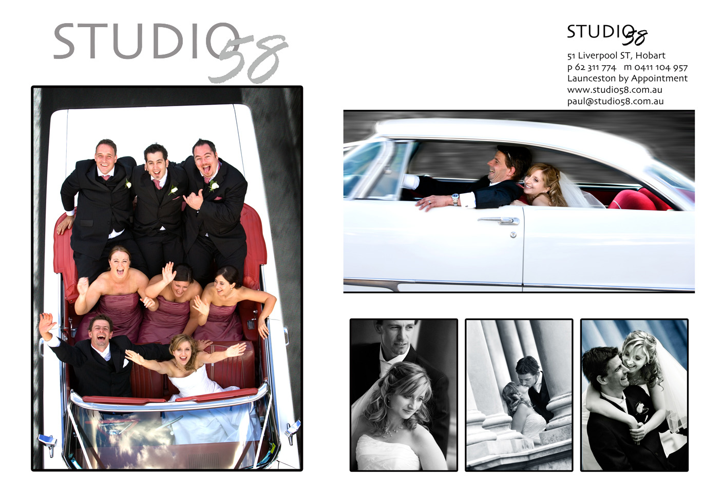
Paul, I like the finished ad.
Ther picture on the left grabs attention and shows the ends you'll go in taking a memorable picture. The one on the upper right is driving into the frame and says they had a wonderful experience!
The B&W images demonstrate that you also do the classical pictures with ease.
I do have one question. The logo.
Have you considered making the number "58" in silver or grey so that it stands out separately from the word Studio?
In fact I'd use two tones of gray. This would be then an implicit connection to the fine tonalities in B&W pictures too.
Maybe the large picture on the left a tad smaller so as to add generous white space below your large logo for Studio 58. Also perhaps small type face on the address on the right.
Anyway, these are just my reactions looking from all the way over here! I'd also consider a light texture like the page in an album.
I like what you have done!
Asher


")