Cem_Usakligil
Well-known member

C&C is welcome, as usual.
Cheers,
Cheers,

Cem,
C&C is welcome, as usual.
Cheers,
Ken,This is a wonderful image, Cem. I could give you a paragraph of pseudo-academic reasons why this is attractive.
Well, you may have sexed her correctly! I took the figure as male! I saw the void in front of her as significant and the fact that the bronze hound is way back and not opposite her, shows further disjunction between what one might "expect" to be complementary worlds. In fact nothing matches. Only the floor and the ceiling join them together. Their symmetry leads us to expect some resonance and equality between both sections contained therein. But it's not the case! The walls are of different colors and the the room on the right has no person to equate with the first.But, at least for me, the one hitch is that woman taking a pic. Perhaps this is just my personal bugaboo but it's a real buzz killer. If she was just standing studying at an unseen painting, perhaps arms folded, terrific. If she was further back in the scene, as a counterpoint to the sculpture and smaller, even better.
Ken,
That would be instructive or at least entertaining. If you could do that not tongue-in-cheek and not pseudo anything, it would be valuable; meaning if you have some other references to such pictures that come to mind, it would be fun to know.
...
Asher


I've no idea if it's still commonly taught in art schools. (Judging by what I see I coming out of some schools I doubt that anything very practical or instructive is being taught any longer.) But I know that I was taught this useful compositional device as a young student and still use it today. In fact I used it just this past weekend:
You are correct, I only referred to segmentation of the parkway into two rectangles, not the picture itself. The horizontal one at the base is obvious.Fascinating, informative thread.
I differ a little with Asher as to the amount of division. I see three distinct rectangles; each one focused on distinctly different activities.
Thanks all for this thread. This is why I lurk here so much.
Thanks Per for looking. Your phone booth pano of London is a more of a perspective twister, nicely done.I like it a lot. It gave my perspective sense a run for the money.
Thanks Rick, really appreciated.I personally love this shot. I really can't give a long winded explanation of why I like it, nor would I try and elevate myself by telling you what you could have done better. I just like it because of the emotional response I get from it. I think that my response is very much subconscious, maybe it is the moment captured, or perhaps the technical aspect of angle and color etc... likely it's both. At any rate, I think its a great shot.
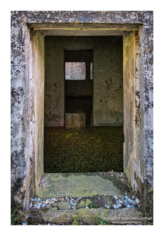
Thanks a lot for the kind comments, I have been considering them carefully. A slight crop from the top seems to improve it a bit indeed. But I am undecided yet about cropping such that the outer frame has the same proportions as the opening to the rooms. Reshooting may not be an option as the museum was open for photography only on that particular day. I will check their website though. This was taken using a 17mm so going even wider is a technical challenge. I would probably shoot tiles and stitch later using an appropriate projection method.Since you requested critique:
I agree with what is written above but, IMO, that picture should be cropped so that the frame is homothetic to the rectangle encircling the door.
Better, but that is another picture: redo it in a square format. Move closer to the door and use a wider angle so as to change the perspective between the door and room and leave less space on the top and bottom but more left and right.
This is not only about dividing the frame as in a Mondrian picture. This is also about symmetry. You need to support that symmetry.
Hi Jerome,
Thanks a lot for the kind comments, I have been considering them carefully. A slight crop from the top seems to improve it a bit indeed. But I am undecided yet about cropping such that the outer frame has the same proportions as the opening to the rooms.
Reshooting may not be an option as the museum was open for photography only on that particular day. I will check their website though. This was taken using a 17mm so going even wider is a technical challenge. I would probably shoot tiles and stitch later using an appropriate projection method.
Speaking of Mondriaan, somebody wrote about this next picture of mine (taken 1.5 years later) that the processing of the ground was particularly well done, allowing it to become part of a single dimensional Mondriaan-style picture within a frame. Also, you can see that the crop of the outer frame is more proportional to the opening as per your suggestion.
C&C is welcome, as usual.
Cheers,
Ken Tanaka said:I could give you a paragraph of pseudo-academic reasons why this is attractive but it wouldn't make it better.
Cem,
C&C is welcome, as usual.
Cheers,