• Please use real names.

    Greetings to all who have registered to OPF and those guests taking a look around. Please use real names. Registrations with fictitious names will not be processed. REAL NAMES ONLY will be processed

    Firstname Lastname

    Register

    We are a courteous and supportive community. No need to hide behind an alia. If you have a genuine need for privacy/secrecy then let me know!
  • Welcome to the new site. Here's a thread about the update where you can post your feedback, ask questions or spot those nasty bugs!

Challenge: Bring out Feelings in this Paris Roof Top Scene

Tony Bonanno

pro member
Challenge: Image from Recent Shoot - Paris Rooftop

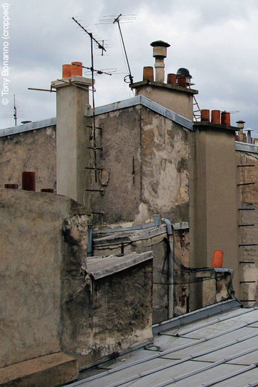
Here's an unaltered, rather flat picture of a rooftop of my recent trip to paris.

I was intrigued by the shapes and textures.

How would you exploit this and bring out the feelings and reactions that one might have being there?

So here's the challenge:

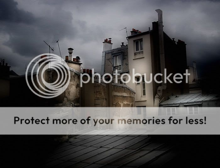
Process this as you wish just keep a layered PSD file for me.

Post an sRGB jpg 800 pixel wide!

Give the steps.

Good luck and thanks for participating.

Tony


From Asher as per OPF policy, put © Tony Bonanno on the edge and all right are assigned back to the original copyright owner.


IMG_7766_.jpg
 
Last edited by a moderator:

Asher Kelman

OPF Owner/Editor-in-Chief
Uwe Steinmueller PDF Book for the Winner!

Thanks Tony. Generous to provide your unprocessed image.

Tony Bonanno is a well-established commercial photographer with also many years of creating and successfully selling fine art pictures too. In fact just we announced his well-received work "Hoofs and Dust" here

This work is an exercise in embedding by altering the physical form of something, the emotions, feelings and thoughts that might make a photograph a work of art.

When Tony was on the rooftop, or if you were there, the sights evoke reactions. Of course we all are tuned differently.

So here, imagine you took this shot from a hole drilled through the roof access door. You had no choice in the composition, nor would anyone else.

So look at this on your screen as if you were there and saw this for the first time.

The picture reminds you of what was there, but it disappoints a little.

Now how would you bring back the life to this shot?

We will leave this open until I sense there are enough responses to choose from.

The winner here will be awarded a PSD training book written byhttp://www.outbackphoto.com/ Uwe Steinmueller of Outbackphoto.com that I have purchased for this purpose. Printing or Workflow.

Good luck!

Asher

Disclosure, the award is given because I believe in Uwe's work and he is a great teacher. I attended his first Photographer's Summit with Alain Briot and Michael Tapes and was so impressed.

So forgive me for awarding a prize. It is not meant to be flippant or suggest that one image wins and another loses, but to remind us that we can learn from each other by sharing.
 
Last edited:

Cem_Usakligil

Well-known member
Hi Asher, Tony,

Just for clarification: is there a higher resolution image to be downloaded somewhere or are we supposed to work on the example posted?

Looking forward to having a go at this :)

Cheers,
 

Asher Kelman

OPF Owner/Editor-in-Chief
We'll answer very soon. I just need to call Tony!

Anyway, glad you are interested in the image. I wish I had taken it, like the picture you made of the two buildings with the cobblestones!

Asher
 

Asher Kelman

OPF Owner/Editor-in-Chief
You can download the file here.

Thanks for your participation. Feel free to make any extractions, changes you like, add, subtract but only publish here in this thread!

Asher

This file has become, after Tony's process work, a finished work of art. We do not provide that! You'd have to purchase that if a copy is available. So this exercise means you can only post here. That is what the limited license is for. This is a serioius matter and OPF will rigorously seek to protect all photographer's rights when they provide their own work for OPF.
 
Last edited:

Asher Kelman

OPF Owner/Editor-in-Chief
Tom,

Over the top? You have a sense of humor. But is that your title or do you have one yet. A title defines and limits what you guide us to think. It's part of the road map to completing the transfer of what's in your mind to what might also be evoked in mine.

I like your rendering and the palette. There is almost a unifying diagonal wall of color.

However, I notice you seem not to have included the foreground roof in any drastic color modification.

So the title?

Asher
 

Brian Lowe

New member
Hi Tom,

Here is my take on this challenge.

I did all of the processing in CS3 first giving the levels a little tweaking then I tried to bring out the sky with some blue. Next I brought up the blacks and contrast then I gave it a little midnight action, fiddled with it a little more to give it some texture.


Here it is,


Enjoy

-Brian-


© Tony Bonanno
126783954-L.jpg


Asher Kelman

OPF Owner/Editor-in-Chief
In art, one only has to think of palettes and elements to work together and not the truth because that is what is created.

Asher
 

Tom Henkel

New member
"Over the Top" it is....

Tom,

Over the top? You have a sense of humor. But is that your title or do you have one yet. A title defines and limits what you guide us to think. It's part of the road map to completing the transfer of what's in your mind to what might also be evoked in mine.

I like your rendering and the palette. There is almost a unifying diagonal wall of color.

However, I notice you seem not to have included the foreground roof in any drastic color modification.

So the title?

Asher
I think the title is appropriate given the subject and my treatment of it. I was thinking of the various Paris artists of the early 20th century who could have painted the same scene (sans rooftop antennae). They would have shamelessly used color to capture a mood rather than accurately presenting the scene. I thought I'd try doing the same. The diagonal wall of color was deliberate -- I was trying to give some depth to the subject. I did that by just using the magic wand tool to select some almost random sections of the building walls and playing with the color and blending options.

Tom
 

nicolas claris

OPF Co-founder/Administrator
Hi Tony
You know that I'm really reluctant to work on other's files...
However, I'll make an exception on this one...
Firts I would have shot and framed it in order to avoid the background to me that is disturbing, not interesting and quite polluting the real raw material that you shot on 1st ground.
Therefore I have 2 different cropped to propose, but this was not easy from the initial point of view, in real I would have moved for a better framing (I mean to my taste of course!).

I hate cropping pics and much prefer full framed ones...

I did
- some level adjustments
- a little saturation
- run an action of mine for USM/sharpness
and cropped:

1st:

IMG_7766_a.jpg


2nd:

IMG_7766_b.jpg


Purpose is to draw the attention on old and raw materials, I would have even tried to zoom more, but from the lowres provided pic, there is not enough definition

please see no offense, just a try...

all the best
 

Tony Bonanno

pro member
Harvey, Nicolas, Brian, & Tom,

I was a little nervous about this exercise initially, but now I'm very pleased as I'm finding myself opening up to approaches that never occurred to me.. the "over the top" (great title by the way), the tight crops of detail and texture by Nicolas, the early generation photo process look of Harvey's rendition (I can visualize this french photographer in the mid-1800's setup on the adjoining rooftop).

I've got a full day and night of "work" to deal with right now, so may not be able to log back in until sometime tomorrow. Thanks to ALL of you so far who have shared your artistic vision with me...

Tony Bonanno
 

Ivan Garcia

New member
jardin sur toit:

Impressive work from everyone.
Here is my vision.
I wanted to bring the textures out, so several adjustment layers were required, once again I work with the flow so I can't really remember all my moves, mainly because every time I ad a new layer I come back to the previous one to re-adjust. The large building to right of the image was cropped out of the final image, as I felt it was too distracting.
PSD file saved.

Tony Bonanno_IMG_7766-1_V2.jpg


Enjoy
 
Last edited by a moderator:

Asher Kelman

OPF Owner/Editor-in-Chief
I was a little nervous about this exercise initially, but now I'm very pleased as I'm finding myself opening up to approaches that never occurred to me.. the "over the top" (great title by the way), the tight crops of detail and texture by Nicolas, the early generation photo process look of Harvey's rendition (I can visualize this french photographer in the mid-1800's setup on the adjoining rooftop). .........

Tony Bonanno

Each person brings his or her own standards and spirit.


Nicolas, I like how your pristinely honest photography comes through in your work. You like to record and show not manipulate.

Your participation adds so much. Thanks for taking us inwards to what’s most important.
Excluding is the part of the essence of photography. The brain needs 1 second between complex thoughts to process them. Focus destroys that bottleneck. Cropping achieves this well.

Brian, Hollywood-tuned; our world through some creative realism. Celebrate what’s before us. Mood enhancing for sure.

Harvey: Classical! This essentially grained monochromed finds its way to galleries with a sense of recorded history. It does not threaten our conscience to say this is now and one should be concerned. I like it.

Ivan, You’ve escaped! Texture, bold color. This has, to me at least, some mathematical flavor flavor of Escher.

Escher_Bonanno.jpg


Asher
 
Last edited:

Marian Howell

New member
Each person brings his or her own standards and spirit.
this really strikes home for me. so true, and so revealing.
i'm a simple soul, looking for sunshine and warmth :) perhaps a less dark and frightening vision than the previous artistic and thought-provoking versions that we've seen. i loved all of them (!!) but that is not my world.
anyway, i worked with color profiles and h/s and levels:

73833584.jpg
 
Last edited by a moderator:

Ivan Garcia

New member
Hi Asher.
Your comparison with MC Escher is very flattering, but, I am afraid, undeserving. Escher had a deliberate way to produce his art, I merely experiment, and let the flow of things direct my purpose, in any case, thank you.
Let me know if you need the PSD file
Marian
I can’t see your image something is wrong with the link

John
I like it! can you elaborate upon your crosshatch technique?
 

Asher Kelman

OPF Owner/Editor-in-Chief
Marian I corrected the links, but aren't the two images the same?

Ivan,

Tony took the picture and you completed the editing.

Iconic images such as The Mona Lisa, Leonardo Da Vinci's Last Supper, and this Escher Picture of 1960, all are embedded in the psyche of our cultures. They're probably part of the symbolism that informs our esthetic senses. So we might make decisoins based on embedded memeories of images such as this.

We make a lot of conscious and even rational decisions. Still, I maintain that choices are also informed by the embedded cultural values and image references we have stored away.

So the shapes seen by Tony and also recognized by you might have triggered memory. I feel that these echo forms chosen by Escher. Still, they could be happenstance. That would be less romantic.

Asher
 

Ivan Garcia

New member
Hi Asher.
Interesting; it would indeed have been romantic if Escher had inspired my editing, sadly, that’s not the case, but, I can assure you, there is nothing coincidental about my work. I have a very unorthodox workflow, I’ll start with a conceptual idea, nothing deliberate, I look at the image I am working on, and start chipping away at the technical flaws; levels here, curves there, saturation… etc, etc… At some point during my editing, the workflow becomes organic, and consequently, it adapts to the particular image I am working on, this approach allows for my goals to be redefined and refined as the work progresses.
In this particular case, my first intention was to bring out the colour and texture of the image, and at one point in the process, the image looked very much like Marian’s interpretation, I would have stop at Marian’s stage, however, I wanted to lighten the bottom left corner shadows; in doing so, the dynamics of the image changed, it became alive. At this phase, the organic part of my workflow took root, and slightly changed the course of my intentions. On arrival to my destination, I ventured in the creation of different variations. Darker, brighter, cooler, warmer, B/W, sepia…. This is what I meant when I said, “I merely experiment…” in my previous post.
With regards of Escher; it was only after the work was completed that I decided to crop the large building out, perhaps, Tony’s picture and the way I edited it, brought subconscious memories of Escher work, and that may have influenced my final decision. Although… The building was extremely bright, and slightly solarized; maybe that prompted my conscious to exclude it from the final version.
Your comments are certainly interesting and have made me wonder, if Tony’s decision to take the picture was also influenced by Escher’s artistry, or just the product of fortuity.
Food for though…
 

nicolas claris

OPF Co-founder/Administrator
Marian I corrected the links, but aren't the two images the same?

Yes it was ! (but now, I have just deleted one) as I did have already relinked the image and left the bad link for Marian to understand why she made a "bad" link...


...........but the link did not work as it still needed a the touch! (Asher)
 
Last edited by a moderator:

Tim Gray

New member
Here's a go...

Layers - blend modes multiply and overlay for overall brightness and contrast, roughly 30% opacity, masks applied
Dodge and burn layer – mode soft light, white and black brush
Local contrast enhancement usm 20 60 0
Saturation adjustment layer adjusted by each color
Slight vignette lens distort (masked out of bottom left corner)
Resize to 800 wide
Sharpen for web – overlay mode highpass filter 1 pix 70% opacity

IMG_7766-1v2.jpg
 

Marian Howell

New member
In this particular case, my first intention was to bring out the colour and texture of the image, and at one point in the process, the image looked very much like Marian’s interpretation, I would have stop at Marian’s stage, however, I wanted to lighten the bottom left corner shadows; in doing so, the dynamics of the image changed, it became alive. At this phase, the organic part of my workflow took root, and slightly changed the course of my intentions. On arrival to my destination, I ventured in the creation of different variations. Darker, brighter, cooler, warmer, B/W, sepia…. This is what I meant when I said, “I merely experiment…”
i did the same thing Ivan! i had some really wild versions going, but i went back to this one because:
1) i thought the thread needed a "tame" version for contrast, and
2) i didn't feel that my experiments were coming from a more thoughtful reasoned approach.
now i'm not sure a plan or purpose is necessary for art at all (and that might be seed for another discussion of "what is art?" :) and i very much enjoy the experimental approach but in this case i returned to the early version. gieven my druthers, i'd have posted several versions LOL!
 

Petter Stahre

New member
Thanks for the opportunity. This is my take:

IMG_7766_tonybonanno.jpg


I cropped the image slightly and made a duplicate to a new layer, blurred it, used Multiply as layer setting and lowered the layer opacity below 50%.

I converted the original (background) layer to b&w, with high contrast, and lightened the image.

On top of all layers I placed an adjustment layer (Curves) to lighten up the whole image.

I also gave the original image a little vignetting and sharpened it.

:) Petter
 

Ivan Garcia

New member
i did the same thing Ivan! i had some really wild versions going, but i went back to this one because:
1) i thought the thread needed a "tame" version for contrast, and
(snip)

Hi Marian
I am so happy to find a fellow “experimental” editor.
I had some pretty wild versions too. The one I posted had the right balance between my original intentions, and the change of route my organic workflow took me to.
You are right; your version brings a subdued feeling of serenity … almost as if the storm clouds ever the rooftops of Paris had passed away.
Thank you for sharing that with us.
 

Asher Kelman

OPF Owner/Editor-in-Chief
Please everyone save your PSD files as I may ask for them so we can have an exhibition of the prints.

Everyone will be acknowledged.

Asher
 

Annie James

New member
I hope you dont mind a Newbie having a go! I used dodge tool to highlight many of the white areas on the main building and annexe walls, selective colouring for the clouds ( blue and white) Desaturated the colours, burned out next to the parts what were dodged to add drama, and finally added some texture. Was a nice Photograph to work with, found many things that werent there on initial viewing.


Annie


edited.jpg
 

Tony Bonanno

pro member
Hi Annie,

I like it. Different for sure. Its been helpful and fun to see the different renditions. Thanks for taking a go at it.

Tony
 
Top