• Please use real names.

    Greetings to all who have registered to OPF and those guests taking a look around. Please use real names. Registrations with fictitious names will not be processed. REAL NAMES ONLY will be processed

    Firstname Lastname

    Register

    We are a courteous and supportive community. No need to hide behind an alia. If you have a genuine need for privacy/secrecy then let me know!
  • Welcome to the new site. Here's a thread about the update where you can post your feedback, ask questions or spot those nasty bugs!

Challenge: Ballroom dancing

ron_hiner

New member
Ok, I got invited to 'take a couple pictures' to a ballroom dance event in June. I'll always say 'YES' to dance photography.

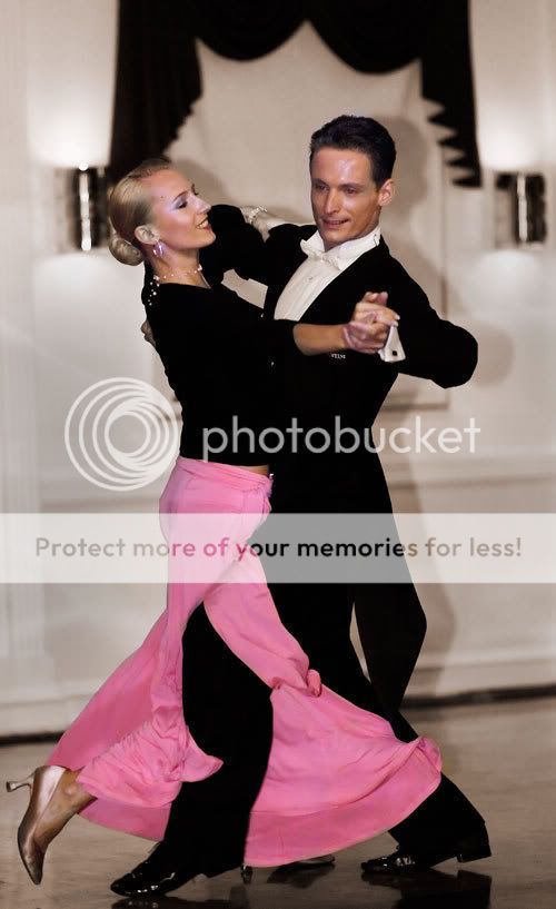
It was in a hotel ballroom (but of course) and the light was terrible... no, I should say the light was beautiful... in those few place where it actually existed. Lucky I had a flash with me.

Here is pretty much what came out the camera that evening...

opf_doreen_070608_182.jpg


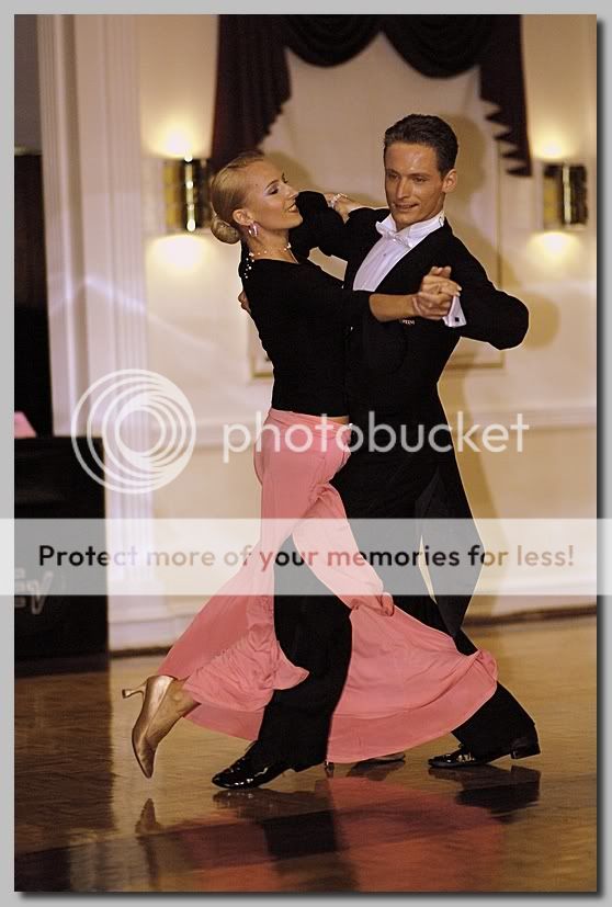
Here is my attempt to bring a nicer image out of those dreadful pixels...

opf_doreen_070608_180.jpg


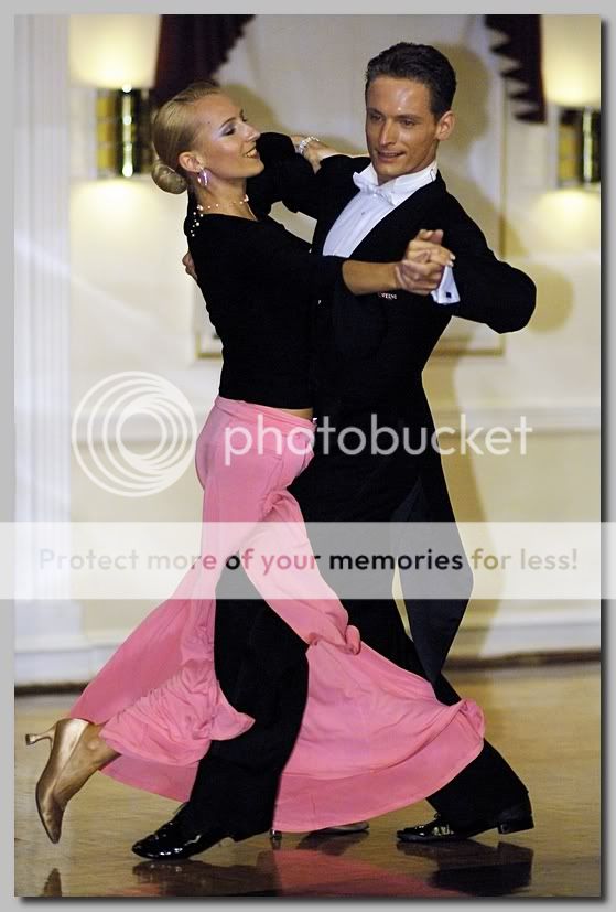
And here is a full size original... (only converted to jpg from raw) for anyone who wants to edit and repost... (6.3 MP download)

http://www.ronhiner.com/opf/opf_doreen_070608_181.jpg

Any one up for the challenge?

Ron

Shot with Nikon D2x at 1/750 @ f1.4 ISO 800. Shot raw... conversion to JPG and all post processing done in Capture NX. No Photochop involved.
 
Last edited:
Hi Ron,
the image is noisy (800 ISO), so I applied a denoise action, then I tried the following:

Midtone increase. I stopped just before the noise is noticeable.
opfdoreen070608181midea9.jpg


Shadow/HighLights
opfdoreen070608181shadhai0.jpg


P.S. the noise is well visible in the original size image.
 

Don Lashier

New member
Here's a quick dual (HDR) version, complete with sloppy masking :)

Ron, I actually like your first interpretation better.

- DL

hiner-dance.jpg
 

Greg Rogers

New member
Getting my feet wet, bear with me! No idea if I like this;
opf_doreen_070608_181OGCR-flat-v2.jpg

Intent;
Aside from the obvious underexposure and such, while fiddling I found the white balance, tones, whatever off, and the background annoying. Never tried a colour / sepia combo before, Not so sure.

Quick and dirty steps;
De-noise
Absurd mid-tone curve increase
Selective Dodge top 1/2 to lighten faces
Channel mixer to enhance skin tones (my eye, might be goofy)
Over-do saturation for effect
Convert to BW sepia
Selective layer mask to colourise intended selections

Finally, flatten and save for web in PS, resulting in total loss of saturation and intent. Another post elsewhere on that. Dumb newbies. (referring to self, of course)

Thanks for providing opportunity to experiment, Ron!
-Greg
 

Greg Rogers

New member
I'm sorry, I'm having some basic trouble editing my posts for some reason. I didn't mean to call the background "annoying". Allow me to change that to "difficult to work with", please.

Also, Ron, I like your conversion just fine. On second glance, one thing I've lost is the wonderful warm glow from the wall sconces.

-Greg
 

ron_hiner

New member
Wow. That photoshop stuff looks like it's worth learning! Huh.

Rachel - As far as I'm concerned, you don't have to learn photoshop, but you have to learn some pixel-level editor very well to correct bad photos like this one. Photoshop has a 95%+ market share (totally made-up number - probably too low), so there is tons of free tutorials out there making it easier to learn. My edited version did not use photoshop at all -- I used Nikon Capture NX. Once I was reasonably happy, I imported the image into Lightroom to sharpen and print.

Don -- you win for bringing the best skin tones out. Can you tell us more about the HDR technique you used? I use HDR sometimes with landscapes... I bracket 3 or 5 shots, pick the two or three best ones and merge them. You started with one lousy JPG. Tell us more!

Don, Giovanni & Greg... nice stuff all. I didn't mention how noisy a badly underexposed shot can be on a D2x at 800 ISO. You figured that out without my help! And everybody was kind enough not to ask why I shot it at 1/750 (I have no idea -- that actually surprised me because my max flash sync speed is 1/250. I must have switched to FP mode. Perhaps the wall sconces tripped up the meter.)

This is the version that I printed...
FADS_070608_472_rwh.jpg


I went for a bit more color on the woman's hair... which works for me. I wanted to create some separation between her head and the background. And I found some detail in the black tones of the man's tux, but even though I brightened them up, they still did not print as anything but dead black.

I took a more artistic approach with the blur... not better, just different.

Greg... the background is very annoying... you can say that. If you could swap out a totally different background, what would it be?

Ron


Any other takers?
 

Rachel Foster

New member
Oh, Ron, I WANT to learn photoshop! If ever there was a clear demonstration of it value, this is it. I apologize if my very dry sense of humor was misleading. I'm quite impressed and motivated to learn it. (As soon as I learn to focus the camera right, I'm looking photoshop)
 

ron_hiner

New member
Oh, Ron, I WANT to learn photoshop! If ever there was a clear demonstration of it value, this is it. I apologize if my very dry sense of humor was misleading. I'm quite impressed and motivated to learn it. (As soon as I learn to focus the camera right, I'm looking photoshop)

No need to apologize...

Here's my fundamental problem with a scene like this... beautiful graceful dancers gliding around a dance floor with an amazing fluid motion. When I took this picture, I saw no background, no pixels, and no noise. (Evidently, I didn't see the light meter either!) What I saw was dancers!

That, unfortunately, is not at all what my camera saw. My camera saw a 12 million pixels of a lovely pair of industrial wall sconces and a lovely linen-white painted wall with two unfortunate black and pink blobs interfering with an otherwise perfectly lovely scene.

Our job is to make pictures of what we see -- not what the camera sees. It's always better and easier to get the camera to cooperate, but.. but sometimes you gotta take those pixels out into the back alley for a little further discussion after the camera has done its duty.

Ron
 

Greg Rogers

New member
Greg... the background is very annoying... you can say that. If you could swap out a totally different background, what would it be?

Hi Ron,
I didn't phrase that right, even with the second post. It's not annoying, annoying, it's difficult to work with and at first glance I thought distracting from your initial "oops" shot...and redo.

Not so sure I'd replace it with anything. The wall sconces work too well with the 50's "art-deco" look. IOW, the background adds value, IMO.

Your final version rocks. (I like pretending I'm young using hip terms). Perhaps I'm being a bit too picky, yet the long, vertical shadow at left, lower distracts (to me, just an opinion)...and you've (arguably) lost the balance of the two wall sconces with your crop. That said, my cropping skills leave a lot to be desired, so please take my 2 pence with a grain of salt!

Rachel: kudos to you for acknowledging the value of post-processing! As I often say, it's a balance between getting the shot right to begin with, and being able to manipulate it. Neither opinion / method is IMHO is entirely correct by itself (again, just my opinion), nonetheless we need to know how to do both...even if we are personally driven more towards one or the other.

Ron has posted a perfect example here. One of those rare "shot of a lifetime" shots where we screwed up. (Geez, I've never done that). This thread exemplifies the difference between "trashing it" and "what can I do with it?".

-Greg
 

Rachel Foster

New member
Well, I think I know one reason why people talk about photoshop so much and the "art" less (not necessarily here on OPF, by the way). Photoshop can be learned but the "eye" is more difficult to learn. So, it makes sense to talk about that which can be learned rather than something that may or may not be "you have it or you don't."

I'm learning.......
 

ron_hiner

New member
I forgot about this tread... but there is a follow up...

The version that I printed made its way back to the dance studio. They loved it so much that they've hired me to do a series of shots for a calendar that they plan on giving out at christmas time.

There is a lesson in there somewhere!

Ron
 

ron_hiner

New member
Plausable reality

Asher...

Her dress is big and floppy... this shot was taken milliseconds after she kicked out with her right leg, and then retreated. The male dancer stepped in, while her dress was still out. So her dress wrapped around his leg.

So what would you do? Clone some of his pants pixels to make it look more like we would expect it to look?

As a retouching guideline I like to follow: make the picture look believable -- even if its not. So perhaps this is a situation where one should clone in some fake pixels to make an unbeliveable picture (albeit real) believable.

Ron
 

Asher Kelman

OPF Owner/Editor-in-Chief
Asher...

Her dress is big and floppy... this shot was taken milliseconds after she kicked out with her right leg, and then retreated. The male dancer stepped in, while her dress was still out. So her dress wrapped around his leg.

So what would you do? Clone some of his pants pixels to make it look more like we would expect it to look?

As a retouching guideline I like to follow: make the picture look believable -- even if its not. So perhaps this is a situation where one should clone in some fake pixels to make an unbeliveable picture (albeit real) believable.
Hi Ron,

Some purists would say it is what it is. However, a picture is meant to be some likeness and to me, at least, the thigh looks weird. I'd clone in some cloth to give her thigh width, or else try making his pany leg dimensional and adding a shadow from it to her leg to give some sense of depth.

The image is flat there and so it seems strange. I thought this was another dancer with an artificial limb. That amazed me since this was above the knee!!

Still some people are great athletes and learn to dance!

Asher
 

Asher Kelman

OPF Owner/Editor-in-Chief
Hi Lindsey.

Good try but maybe the simplest thing to do is expand the pink cloth a little to the left so it looks like it could contain a limb!

Asher
 

Todd harrison

New member
yeah I have to say the lighting it really dark. this could be one of your main problems. your edited picture looks like a glamor shot. it help a lot if you take a picture with proper lighting i know that is not always easy. but I think a glamor shot is out of the question. making the picture lighter is a better way to go. I do like what Barry Johnston did to the picture it the best one for sure. their is still very little light on the faces.
 

Barry Johnston

New member
You've done well....

I think you've done well Fred !! Yours is sharp and clear and quite smooth in comparison to mine. I think mine could do with a bit of lifting, it's a bit muddy....

Regards,
Barry.
 

Fred Spencer

New member
Thanks

Barry, Greg,

Thanks very much. It was processed very quickly in Picasa then resized, sharpened and drop shadow added in Faststone Image Viewer to post back on here. Two great free programs and the work took less time to do than the time it took for the two programs to open on my computer.
 

StuartRae

New member
Well, I may as well join in the fun.

The main problem IMO was the WB - makes the skin look a bit malerial - so I assumed the door frame (?) was white. Then I adjusted the shadows in Light Machine and sharpened (was it necessary?) with Focal Blade.

doreen-LM.jpg


Regards,

Stuart
 

Nill Toulme

New member
Sorry I can't let this thread go by without pointing out that it is a prime example of the problems with on-camera flash, especially in portrait orientation without a bracket. Maybe just a pet peeve, but the thing that jumped out at me first and foremost about this shot is the flash shadow. Use of a bracket to get the flash over the lens, and bounce, with or without your favorite bounce attachment gimmick, to soften the light, would have made for a much better start.

Nill
~~
www.toulme.net
 

ron_hiner

New member
Nill -- the list of mistakes on this shot is long, but that's not the point. The point of thread is to rescue a good shot from a steaming heap of garbage. I'm very impressed at the effort and time people have put into this. I have learned much -- I hope others have too.

Ron

ps... it wasn't a on-camera flash. It was held in the hands of my marginally-willing assistant who simply didn't want to hold the flash above her head. The distance from camera to subject made the flash appear closer to the camera than it really was. And the truth is, I have never been able to get a nice bounce flash anyway -- I always seem to get ugly dark circles under the eyes.
 

Nill Toulme

New member
That's what the various gizmos — Gary Fong Lightsphere, Joe Demb Flip-It, etc. — help so much with, i.e., throwing enough light forward to avoid that sort of thing, while still giving a nice soft light overall with no or minimal shadowing.

Sorry for the digression though, carry on. ;-)

Nill
~~
www.toulme.net
 

Fred Spencer

New member
Another go

It is a pity about the flash shadow and perhaps a multi lighting set up would be the way to go (on camera for fill light and off camera for overall effect). I bought a 50mm f/1.4 lens and a 580EX mkII earlier this year to help take better pictures of my new twin grandchildren. Using the 50mm lens for its low light capability was much more difficult for me than using the flash, bounced off the ceiling with my 17-85mm lens. I found that software helped with getting sufficient light into the face to avoid problems with shadows there.

But the exercise of trying to make the best of the shot taken is, I think, still valid. Seeing what others can do is a learning exercise for the OP and others, myself included. 'Photographers' can, and will, scrutinize images to the nth degree. The only test that matters though is whether the subjects like them. Thankfully my family (one lady with a prominent double chin excepted) and the OPs dancing subjects like what they see.

Submitting a less than very good shot on a site like this is quite daunting in the first place and those that do should be commended (this is why you will struggle to find much that I have done). Giving advice how to take a better shot in the first place and advice how to make the best of any shot taken are both valid. Those who take the time to do this should also be commended. At the end of this process the OP will, I'm sure, be able to please his subjects even more.

I've had another go following my mate Stuart's white balance led posting. This version, to my eyes, make the shadows less prominent than my original warmed up submission. The downside is that I'm less keen on the skin tones. Another poster cropped and straightened the image which I have also done this time as it also improves the overall image.

And finally (I do go on a bit, don't I?) I don't have a problem with the lady's skirt. An important part of ballroom dancing is correct body contact (I watch Strictly Come Dancing so I'm an expert on this :) ) and this pose looks pretty good to me. It shows the interaction of the bodies and I think a sense of movement well captured.

opf_doreen_070608_181fs-2-800.jpg
 
Top