Hi Jan,
I have to agree with Nicolas. I've never seen a digital landscape photo that benefited from a B&W conversion. Portraits and abstract 'arty' shots are OK, but a landscape loses so much if it's condemned to 256 shades of grey.
The most famous photographers of the Lake District were the Abraham brothers (1890 to 1920), but I bet they'd have used colour if it'd been available!
Lovely shots, but any chance of seeing the colour versions?
Regards,
Stuart
Oh go on then, I'll wade in.
I'm not sure that colour is always best in landscapes - there is a problem with (too much) green (though Fahim has commented that he likes it). Look at paintings and see how many avoid green as the dominant field.
However, I agree that a lot of monchrome conversions from digital sources look flat and uninteresting. I did one a month or two back that ws almost, but not quite, there. In part I think it has to do with a lack of texture that film gives (or you can simulate in a range of ways from the cheap to the expensive) and the way film compresses highlights effectively.
Janet, to be honest, these aren't working as well for me as a lot of your other work. I'm in a hotel on a laptop with an ugly screen, so please take this with a pinch of salt, but they do look a bit flat to me. The skies and overall pictures are darker than I think works for these and the local contrast could be enhanced a bit. You might try something as simple as increasing the blue slider in the B&W mix, adding an S-curve with a bigger top loop to brighten and increase mide tone contrast and a low opacity duplicate overlay mask or USM local contrast enhancement. You might also try toning them slightly.
I can't try any of this here so it's just a thought.
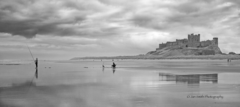
My favourite by the way is Bamburgh Beach with Castle and Fisherman, and I do understand why you are working on these in monochrome and not including the full technicolour.
Mike.


 )
)


