• Please use real names.

    Greetings to all who have registered to OPF and those guests taking a look around. Please use real names. Registrations with fictitious names will not be processed. REAL NAMES ONLY will be processed

    Firstname Lastname

    Register

    We are a courteous and supportive community. No need to hide behind an alia. If you have a genuine need for privacy/secrecy then let me know!
  • Welcome to the new site. Here's a thread about the update where you can post your feedback, ask questions or spot those nasty bugs!

Photoshop - the "luminosity" blend mode

There are several ways to express chromaticity (all involving two values); one that is widely used in scientific work is the CIE x-y system. It is that notation that is used on the familiar "chromaticity diagram".

Hi Doug,

While probably nothing new to you, but just for the sake of completeness, and a point of reference for others, there are several flavors of the CIE chromaticity diagram in use. For most uses the traditional CIE 1931 xyY version is used, but when one requires a somewhat more perceptually uniform version (e.g. for determining Correlated Color temperature on the Blackbody emission locus) one can use the CIE 1979 Luv version, although it also has its limitations (e.g. with regards to luminance differences and between colors with different illuminants).

Cheers,
Bart
 
OK, but for the gradients along the spectral hue angles, you did not just use only the cyan and red swatch, but you forced it along yellow or purple with a middle swatch, didn't you?

Correct. Working with the gradient tool allows to specify intermediate colors, thus forcing the gradient along a certain path that deviates from pure mixing of additive(!) RGB color (the first pair of gradients).

Doing that you just show that RGB (or rgb) and it's standard mixing modes don't do a very good job in blending colors. Sure you can mute that effect by changing the gamma, but the only thing you do is make it less noticable, you don't improve it.

That's a bit depending on where one's reference is. You obviously work more with subtractive colors, such as in print where pigment/dye color is subtracting from the light as it reflects. RGB is an additive color model where light is mixed. That probably is the reason why you experience the gray mix color as unnatural, although it's the natural mix of equal amounts of Red, Green, and Blue light.

The middle bottom example is exactly what Lab cyan to red would give you... Not that you would see a cyan to red blend very often in real life, but the blend is a lot more natural, and for me it's a big plus for using Lab instead of using linear gamma in RGB.

Understandable from the perspective of subtractive color ..., but for additive color Cyan and Red are just different wavelengths which transition seamlessly from one (through Green, Yellow and Orange) to the other along the visible light spectrum (the second pair of gradients).

Cheers,
Bart
 

Doug Kerr

Well-known member
Hi, Joachim,

So if I understand correctly, at 50% blend you would get a nice, medium Gray, when all the values are identical.... :)
Yes, quite (and I should have included that as a "step" so that would appear).

How did you calculate the relative luminance of the resulting colorsteps?
The procedure is:

• For each coordinate, convert the nonlinear value (such as B) to its linear value (such as b). This is done following the "gamma precompensation function" for the color space involved. For example, for sRGB that is very nearly (with all values on a scale of 0-1):

r=R^2.2, g=G^2.2, b=B^2.2

• Multiply r, g, and b by the "weighting values" that describe the relative sensitivity of the human eye to the chromaticity of each primary.

• Add the three weighted values. The result is the luminance of the color.

(I have an Excel spreadsheet that does this for me!)

And when bright red has a lower Rl than bright cyan, does that mean red appears about 2/3 darker to the eye? Because it does not seem to be that way... You will notice that on the upper two examples Bart posted.
Quite so. The human perception of "brightness" does not go linearly with luminance. One simple model is that the perceived brightness goes as about the cube root of luminance.

One might, therefore, think that some indicator of "brightness" would be a better objective measure, as one of the two "basic" properties of color, than luminance. But the attraction of luminance is that, if we combine two light sources of different chromaticity, the luminance of the combination will be the sum of the luminances of the two sources. (That is not true of any "brightness" measure.)

That is, if we combine two light sources of the same luminance (perhaps different chromaticities), the combination will have the same perceived "brightness" as a light source having twice that luminance. (And yes, that brightness will not be "twice" the brightness of the individual ingredients.)

In fact, in the L*a*b* color space, L* is defined essentially as the cube root of luminance (with some wrinkles). Thus it can be thought of as an fairly good indicator of brightness. The reason it is called lightness, not brightness, is that the L*a*b color space was not originally intended to describe the color of light, but rather the "reflective color" of surfaces. (It has been "hijacked" for use to describe the color of light.)

Best regards,

Doug
 

Doug Kerr

Well-known member
Hi, Bart,

Hi Doug,

While probably nothing new to you, but just for the sake of completeness, and a point of reference for others, there are several flavors of the CIE chromaticity diagram in use. For most uses the traditional CIE 1931 xyY version is used, but when one requires a somewhat more perceptually uniform version (e.g. for determining Correlated Color temperature on the Blackbody emission locus) one can use the CIE 1979 Luv version, although it also has its limitations (e.g. with regards to luminance differences and between colors with different illuminants).
Well said. I didn't go into that in my note, for various reasons.

Note incidentally that the "x-y" plane refers to a specific one of those (the "1931"). And that is certainly the one we most often see in connection with gamut issues (which is of course a matter that is wholly bungled by looking only at the chromaticity aspect of a gamut!).

Thanks again for your inputs to this fun stuff!

Best regards,

Doug
 

Doug Kerr

Well-known member
Hi, Joachim,

So if I understand correctly, at 50% blend you would get a nice, medium Gray, when all the values are identical..
Just to pick this up again, note that this does not say that of we combine two light sources, one "red" (G=B=0) and one "cyan" (R=0, G=B) of equal luminance that we will get gray.

R,G,B=255,0,0 and R,G,B=0,255,255 do not have the same luminance. (On a scale of 0-1, the "red" has a relative luminance of 0.213 and the "cyan" a relative luminance of 0.787.)

Now suppose (!) we have two colors of those two chromaticities but the same luminance. If we combine those, we would not get a gray (R=G=B). I can give a numerical example a little later; I have to use another "tool" to make the determination.

Best regards,

Doug
 

Joachim Bolte

New member
That's a bit depending on where one's reference is. You obviously work more with subtractive colors...

I do, as does 90% of the other photoshop users, eventually. And if we are working on an image that is meant to be viewed, there is no use for linear gradients and additive colormixes.

Could you give me one example in photo-editing where using linear gamma and/or additive mixing are handy?
 

Joachim Bolte

New member
Hi Doug,

But why then they blend, using a gray with a Rl of 50%...

And I am not sure that if we combined two colors wit the same Rl, we would get nog grey but color... because the RGB system doesn't care too much about this Rl, it's totally dependend on the colors the gradient travels trough.

Same question for you as I gave Bart. Could you give me a real life example for the practical application of this knowledge?
 

Doug Kerr

Well-known member
Hi, Joachim,

Hi Doug,

But why then they blend, using a gray with a Rl of 50%...
What is RI?

And I am not sure that if we combined two colors wit the same Rl, we would get nog grey but color... because the RGB system doesn't care too much about this Rl, it's totally dependend on the colors the gradient travels trough.
Not clear what you mean. (I can probably tell once I find out what "RI" means.)

I assume that when you say "not gray but "color" you mean "not gray" or "not neutral" (since "gray" is a family of colors, not a "non color"). (I know it is hard to get used to talking that way, but we must when being technical to avoid ambiguity.)

[quoteSame question for you as I gave Bart. Could you give me a real life example for the practical application of this knowledge?[/QUOTE]
I pass. But I would assume that it would apply if we want to do, in an imaging-processing application, the same thing that would occur in actual life when light of two specific colors was combined.

Best regards,

Doug
 
I do, as does 90% of the other photoshop users, eventually. And if we are working on an image that is meant to be viewed, there is no use for linear gradients and additive colormixes.

Could you give me one example in photo-editing where using linear gamma and/or additive mixing are handy?

Besides the whole discussion about creating correct gradients for all sorts of purposes, sure, how about web publishing? Or how about preparing output for (fine art) inkjet printing, a fully RGB process despite the inks being up to a dozen different subtractive colors.

Then we have the fields involved with artwork preparation for (CGI) video work, from full feature Cinema productions (think Avatar) all the way to video game design, and design for interactive commercials, using a technique called Image Based Lighting (IBL) where subjects/objects can be placed in various surroundings and adopt the matching lighting.

To cut it short, every aspect of RGB blending becomes manageable, to the point that hardware such as your graphics card in the computer depends on being supplied with correct gamma information. Even the Windows 'Cleartype' fonts on a computerscreen require correct gamma blending parameters in the registry ...

Cheers,
Bart
 

Joachim Bolte

New member
I assume that when you say "not gray but "color" you mean "not gray" or "not neutral" (since "gray" is a family of colors, not a "non color"). (I know it is hard to get used to talking that way, but we must when being technical to avoid ambiguity.)

I hope we don't get too technical to forget the practical use of things, or get caught up in semantics... :/ when I say 'gray' in accordance to rgb, I mean the family of 'colors' that has the same value for r, g and b.

when thinking 'photo-editing' it's VERY unnatural to have a colorgradient travel trough a gray. or to have a gradient blend in a way that makes the visual middle gray NOT middle gray. That's why I asked you guys for the practical applications. It's nice to talk a bit about color theory, but I think it's not very wise to encourage the average user to set up 1.0 gamma blending without him completely knowing what it affects, how it affects things and if these effects are desireable.

That's the reason why I replied to Pictus' post on the DPR-forum. He saw something he liked, but did not know what and why...
 

Doug Kerr

Well-known member
Hi, Joachim,

I hope we don't get too technical to forget the practical use of things, or get caught up in semantics... :/ when I say 'gray' in accordance to rgb, I mean the family of 'colors' that has the same value for r, g and b.
No, that is perfectly fine - very accurate. It's when you distinguish these "gray" colors from "color" colors that I get itchy. That is, "color" is not the alternative to "gray" (in technical work - certainly in painting a room it is.), since "gray" is a color (a family, really, as you point out).

I'm not trying to "get caught up in semantics". I'm just trying to have us avoid saying, "he got a poodle as a pet rather than a dog".

So what is "RI"?

Thanks.

Best regards,

Doug
 

Doug Kerr

Well-known member
Hi, Joachom,

Hi Doug,

But why then they blend, using a gray with a Rl of 50%...
Huh?

And I am not sure that if we combined two colors wit the same Rl, we would get nog grey but color... because the RGB system doesn't care too much about this Rl, it's totally dependend on the colors the gradient travels trough.

If we have a gradient running between two colors with the same relative luminance, it might pass through (or very near to) a gray or not, depending on what the two colors were.

Best regards,

Doug
 

Doug Kerr

Well-known member
Hi, Joachim,

when thinking 'photo-editing' it's VERY unnatural to have a colorgradient travel trough a gray . .
Perhaps, but that can well happen, whether blending is on a linear or gamma precompensated basis, depending on what the two end colors are.

. or to have a gradient blend in a way that makes the visual middle gray NOT middle gray.
I'm not sure how you define "middle gray".

Are you saying that, whatever that is, it is not desirable for a gradient to pass through some other gray? (You suggested earlier that it is not desirable to have the gradient pass through any gray.)

Best regards,

Doug
 

Joachim Bolte

New member
Hi, Joachim,


Perhaps, but that can well happen, whether blending is on a linear or gamma precompensated basis, depending on what the two end colors are.


I'm not sure how you define "middle gray".
As the middle of the color family that ranges from pure black to pure white. And that is what started this whole thread, because what you would mathematically calculate to be the middle of this scale, is not what you wou you PERCIEVE as the 'middle' on your screen. Hence the Gamma correction. That's why I am stressing that most photoshop users should leave the gamma setting at it's default, because they work visually, not mathematically. There are some high-end users that have profit from it, but that's a minority, and those people know exactly what they are doing.
Are you saying that, whatever that is, it is not desirable for a gradient to pass through some other gray? (You suggested earlier that it is not desirable to have the gradient pass through any gray.)
In my (subtractive) opinion, the only gradient that should follow through gray, is a gradient in the grayscale family, f.e. one ranging from black to white.

Visually speaking gradients that have a color (defined as a value that is NOT equal in r,g and b) should follow the visible spectrum. A rainbow does not go from cyan to red through grey, it follows the spectrum. sure, there is additive and subtractive mixing, like Bart stated, and when using ink, there are possibilities of getting a gray in a gradient. But when editing a photograph, one doesn't think 'ink', one thinks 'light' and works that way.

By the way, my gut feeling tells me that if you take two equal amounts of white and black ink, and you mix them, that you would NOT get something one PERCIEVES as 50% in between those two... however mathematically 'in the middle' this color will be.
 
By the way, my gut feeling tells me that if you take two equal amounts of white and black ink, and you mix them, that you would NOT get something one PERCIEVES as 50% in between those two... however mathematically 'in the middle' this color will be.

That is because our eyes are not CRT or LED displays.

Our displays have a response to input voltage that doesn't follow a linear response curve, but a Gamma 2.2 curve (either by factory default or by profiling the display to that value). To compensate for that, and for the sensitivity curve of the human eye, the data to be displayed is first "gamma precompensated" by an inverse gamma curve in order to get a perceived linear response at the end.

This procedure is similar to the 'gamma' of negative film being compensated by an approx. inverse gamma of the photochemical printing paper.

To give an example for 50% 'middle gray', 0.5^2.2 (= 21.764%) is precompensated by 0.5^(1/2.2) (= 72.974%), where the '^' character stands for 'raising to the power of'. Precompensating would thus require 72.974% of maximum output, or RGB 186 on a scale of 0 to 255. This is of course only necessary if the software doesn't adjust the gamma in an other way (by doing a gamma precompensation itself on the image data). It's that behavior that can be steered with the RGB blending setting, but it e.g. doesn't work with the gradient tool so one needs to compensate oneself to avoid darker mixes and odd colors in RGB.

Different RGB numbers can be caused by the native gamma value encoding of the particular colorspace in use. Notably sRGB uses an composite response curve, part straight line, part gamma.

For some more background:
http://en.wikipedia.org/wiki/Gamma_correction
or
http://www.cgsd.com/papers/gamma.html
http://www.cgsd.com/papers/gamma_intro.html
or
http://www.bberger.net/rwb/gamma.html
or, if you really want to get to the bottom of it:
http://www.poynton.com/GammaFAQ.html

Cheers,
Bart
 

Doug Kerr

Well-known member
Hi, Bart, Joachim,

That is because our eyes are not CRT or LED displays.

Just as an aside, as I mentioned elsewhere, the human perception of "brightness" goes roughly as the cube root of luminance. It thus goes roughly as the L*a*b* coordinate L*, because that goes roughly as the cube root of luminance (there being a few wrinkles in the soup).

In that regard, some people consider the gray color for which L*=0.5 (to use a 0-1 scale) to be "middle gray". Others think it is Y=0.5. Other think it is R=G=B=128. Others prefer to have no real idea what it means, as it can then be used in conversation with less thought.

Best regards,

Doug
 

Doug Kerr

Well-known member
Hi Joachim,

As I understand it, your position is that it is not aesthetically attractive for the "path" of a gradient between two colors (neither of which is, or is close to, a gray) to pass through, or near to, any gray color.

Instead, you say:, "Visually speaking gradients that have a color (defined as a value that is NOT equal in r,g and b) should follow the visible spectrum."

I understand that by this you do not mean to define some rigorous path, but are colloquially describing a concept. But I have trouble understanding what concept that is.

First, being rigorous for the moment (to establish a frame of reference), we recall that we cannot represent in the sRGB color space any color that is truly part of the spectrum. Thus, we cannot move from one color (not in the spectrum) to another color (not in the spectrum), following the spectrum.

Again, I realize that your description is "colloquial". So what might be an attainable "path" of a gradient that fulfills your vision?

Let me deal with this matter solely on the basis of chromaticity, as that will eliminate the need to visualize paths through three-dimensional color space.

Here we see the 1931 CIE chromaticity diagram (the "x-y" diagram).

gradients_03L.gif


R, G, and B are the chromaticity of the three sRGB primaries. R is thus the chromaticity of all colors for which R,G,B=n,0,0.

I arbitrarily define C ("cyan") as the chromaticity of all colors for which R,G,B=0,n,n.

W is the sRGB white point. This is the chromaticity of any color which, in the sRGB context, we consider "gray" (R=G=B, in fact).

Now suppose (!) we are interested in a gradient between two colors, one of which has chromaticity "R" and the other chromaticity "C". Consider the "obvious" or "direct" gradient. For what we will see next, tt will not matter whether we consider that to be reckoned on a "gamma-precompensated" or a "linear" basis.

If we plot all the colors in that gradient, giving the locus of that gradient, we will get the the locus labeled "gradient 1".

It passes through the white point (a gray color). This is the result that you find aesthetically undesirable.

But what locus might you prefer? Perhaps the one labeled "gradient 2", or the one labeled "gradient 3", or even the one labeled "gradient 4" (although the latter seems to ignore the criterion of the avoidance of "purple"). Or perhaps you visualize some rather different locus.

And in what way might we think of your favorite as "following the (visible) spectrum"?

Best regards,

Doug
 

Joachim Bolte

New member
Instead of going into the theoretical argument again, let me ask you one thing: What do you, personally, think about this gradient? Or the green-purple transition in Barts first post? Do you like to see it that way?

Sure, we can build whole theoretical models around this, and you have a very eloquent way of putting things, but at the end all boils down to the question 'how does it look?'

Well then, how does it?
 

Doug Kerr

Well-known member
Hi, Joachim,

Sure, we can build whole theoretical models around this, and you have a very eloquent way of putting things, but at the end all boils down to the question 'how does it look?'
Then I suggest you not use pseudo-technical phrases like "follow the visible spectrum" to speak of some broad (possibly even vague) aesthetic guideline concept you have in mind.

I'm also having trouble with the whole idea of a gradient "beauty contest". "How would I like a certain one" - as what? As the entirety of a work of art to hang on my wall? As the background for a poster for a coffee house? As the background for an invitation to the consecration of an bishop? As a transition between blocks of two different background colors on a catalog page for valves? For nutritional supplements?

All the time in this forum and others I run into somebody who expresses some concept or recommendation of a technical nature, describing it in "technical" terms. I respond, asking for some clarification as to what is meant, or perhaps suggesting that the concept, or its description, is not apt.

Then, the rejoinder is, "oh, you're just playing with semantics", or, "no need to get theoretical about it - how it looks is all that counts."

Well, OK then.

Best regards,

Doug
 
Exactly... and then explain to me again why you would advise the average Photoshop-home-enthousiast that determins things BY EYE to change the blendingsetting to 1.0? Just because it makes edge-transition seem less harsh?

As soon as you would be able to see the data in a file without the use of a display device that alters the input signal, you would have a point. Let me know when you can do that, I'd be interested.

Until then, we need to compensate for the alteration that takes place, unless we don't value correct reproduction (which for artistic reasons can be done).

It's not about harsh edge transitions, it's about 'un-corrupting' the data (luminosity and color) that is displayed, and the functionality to do that is there in Photoshop, for a reason ...

Cheers,
Bart
 

Joachim Bolte

New member
Yep, the true mathematicians... you can calculate everything, but fail to find any practical use for your calculations, even have trouble with giving your own personal opinion about things... If a client would tell you something looked like crap, you would go, grab your calculator, and try to prove him wrong, wouldn't you?

It isn't that hard of a question, is it? Do you find a gradient between two complentary colors the 'rgb way' aesthetically pleasing, or not? And what about if you calculated rgb back to XYZ, and then did the calculations in a CIE colorspace like L*ab, L*uv or L*CH, that mimic the reaction of the human eye instead of that of a display...

I have to say I expected something else, when I registered for this site... But wel, If you guys are happy that way, and get beautifull results doing your thing...

I'm going to look now how to unsuscribe. Be happy.
 
Do you find a gradient between two complentary colors the 'rgb way' aesthetically pleasing, or not?

I thought the answer to that was obvious by now, yes, just like nature does it.

And for those who prefer to think that math has nothing to do with how image colors look on screen or in print, have a look (on screen or in print) at this file. It has a gradient of spectral colors(!) in a very smooth transition from dark to light. There is a reason why the pattern doesn't look as smooth on your display/print though ..., but gamut mapping might take some math to explain.

Cheers,
Bart
 

Doug Kerr

Well-known member
Again, I must point out that there are many pairs of colors such that a gradient from one to the other will pass through gray when "done the RGB way" but will not pass through gray when done "the rgb way" (great terms, by the way).

That in fact is true of almost any pair of "complementary" colors (if we choose the right definition of "complementary"; it has no formal definition in colorimetry).

So I think there is a red herring afloat here. Now if Escher could have it morph into a cyan herring . . .

I'd give a demonstration, but that would involve that accursed "mathematics".

Doug
 

Doug Kerr

Well-known member
This thread began, more-or-less, with a discussion of the effect of different "blending" modes (and the probably-related issue of color manipulation with gamma-precompensated coordinates vs. linear coordinates) on the blending of different image components. Somehow it morphed into a discussion of the effect of those different modes of coordinate manipulation on the "locus" of a gradient.

There was then an effort to morph it into a discussion as to whether there was an inherent aesthetic advantage to gradients whose locus did not pass through (or near) the reference white chromaticity (a "gray" color) over those whose locus did.

I won't demean this arena by discussing where it went next.

I'd really be glad to have some more inputs on the initial (and I think more important) issue - the implications of actually blending image components on a gamma-precompensated vs. a linear basis (in "the RGB way" or "the rgb way", to use Joachim's very useful colloquialisms).

Best regards,

Doug
 

Doug Kerr

Well-known member
Hi, Bart,

And for those who prefer to think that math has nothing to do with how image colors look on screen or in print, have a look (on screen or in print) at this file. It has a gradient of spectral colors(!) in a very smooth transition from dark to light.
At the expense of sounding like Doug Kerr (and who would be better qualified to do that!) I have to ask what spectral colors means.

Of course we cannot represent any spectral colors in any color space we use for images in photography. So perhaps a practical "adaptation" of the term to a practical color space is "colors of all the hues that the color space can represent, at their respective maximum available saturation" (and see below regarding "saturation" in this context).

That having been said, it seems as that the basic premise of this plot is to start, along the "equator", with the repertoire of all hues the color space can represent at the maximum possible saturation and luminance (under the color space) for each.

Then, as we move upward from the equator, we hold the hue, decrease the saturation (toward zero), and always use the maximum available luminance (which is not constant with for the different hues).

As we move downward from the equator, we hold the hue, hold the saturation*, and decrease the luminance (toward zero).

* By that I mean holding the value of "saturation" as commonly used in connection with a color space; this may not be true of the saturation as defined in colorimetry. For example, the sRGB colors RGB=255,0,0; RGB 0,255,0; RGB 0,255,255; RGB 0,255,0; and RGB 255,255,0 all are thought of in this pragmatic way as having a saturation of 100%. Yet none of them has saturation 100% in colorimetric terms, nor do they all have the same colorimetric saturation.​

Interesting.

Thanks.

Best regards,

Doug
 
Last edited:

Doug Kerr

Well-known member
That color panel reminds me of the matter of the infamous "bicone" representation of RGB color spaces. The three-dimensional figure essentially comprises two circular cones with their bases stuck together. It is said to help understand some of the properties of RGB color spaces.

The proponents of this rarely tell us what the three cylindrical coordinates represent. If pressed, they generally say that the vertical axis (apex-to-apex) represents "luminance", the radial axis represents "saturation", and the azimuthal coordinate ("longitude") represents hue.

I put "luminance" and "saturation" in quotes to recognize that these are not the normal colorimetric quantities. Rather, they are "cousins" of those quantities that work conveniently in the context of an RGB color space. For example, the colors RGB=255,0,0 and RGB=0,255,0 do not have the same luminance, but it can be handy to think of them as having the same "luminance" in this context. Fair enough.

The story goes: the fact that the figure tapers to a point at the top reflects that, in a RGB color space, as we increase the "luminance", the available range of "saturation" shrinks. When we reach maximum "luminance", there can be only one color (wide-open white), whose saturation is zero.

This part of the story is sensible.

Now, below the equator, the story is that: the fact that the figure tapers to a point at the bottom reflects that, when luminance reaches zero, there is only one color possible, "black", and it has zero saturation.

But that is untrue. The fact is that for zero luminance, saturation is undefined (not zero). If we go to a very tiny but non-zero luminance, we find that the full range of saturation is available. For example, the color RGB=5,0,0 should be considered to have the same saturation as the color RGB=100,0,0. (If we "amplified" all its RGB coordinates in proportion, which we know would keep the same chromaticity, and thus the same saturation, we could reach 100,0,0.)

Thus, in fact, the three-dimensional figure in this coordinate system is a cone atop a cylinder, not a cone atop an inverted cone.

So the "bicone" outlook is cute, but meaningless.

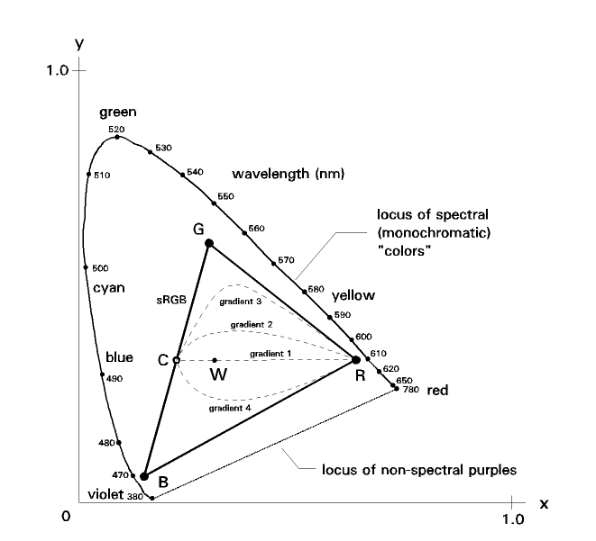
Now, in the coordinate system I described, any horizontal plane is a plane of chromaticity (in a special, pragmatic sense).

If instead we define the radial coordinate so that any horizontal plane becomes a plane of chrominance, then we would have a figure that is essentially a bicone.

Chrominance refers to a property of color that can be thought of as "a dose of not-white light added to a certain quantity of white light to produce the color of interest". For any white, the chrominance is zero. For black, chrominance is undefined, but for a color of very low luminance ("almost black"), chrominance is almost zero.​

Best regards,

Doug
 
Top